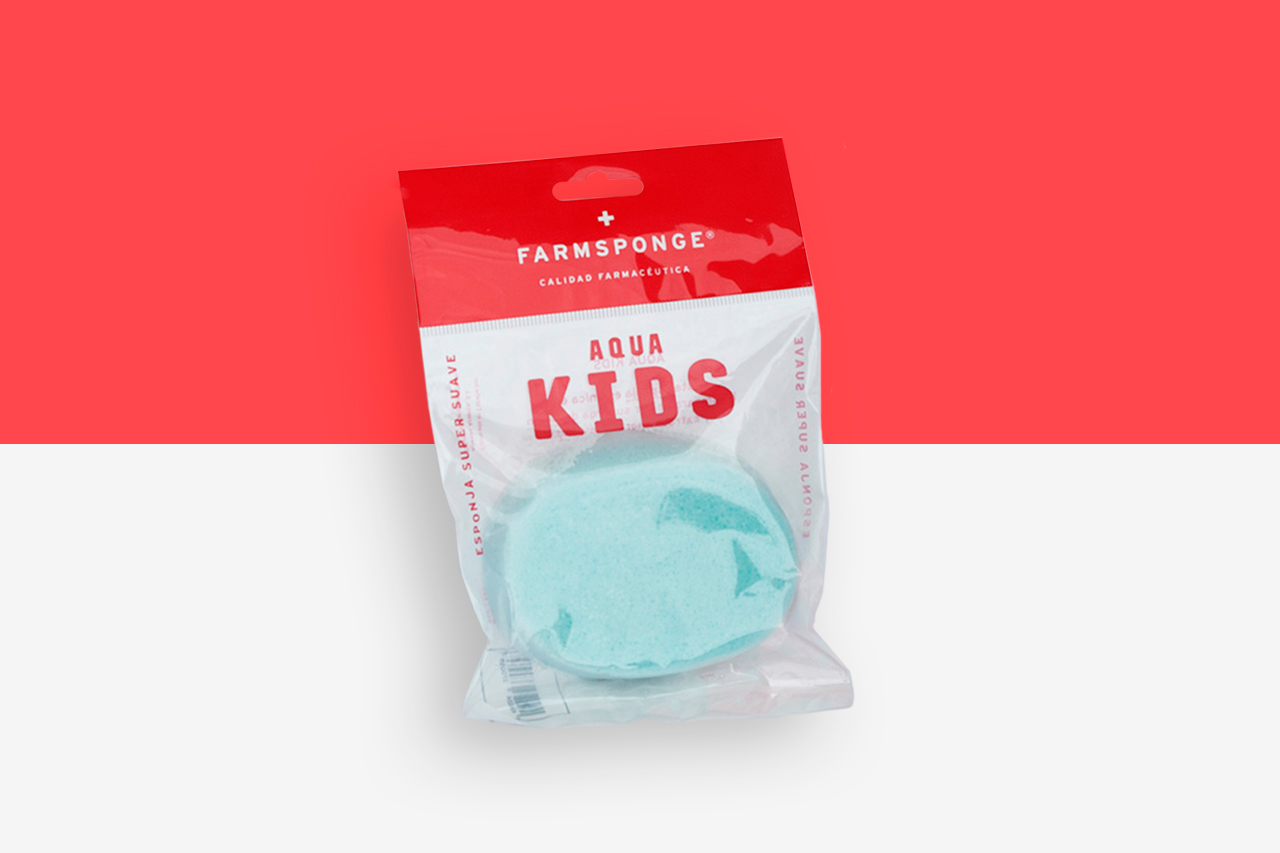
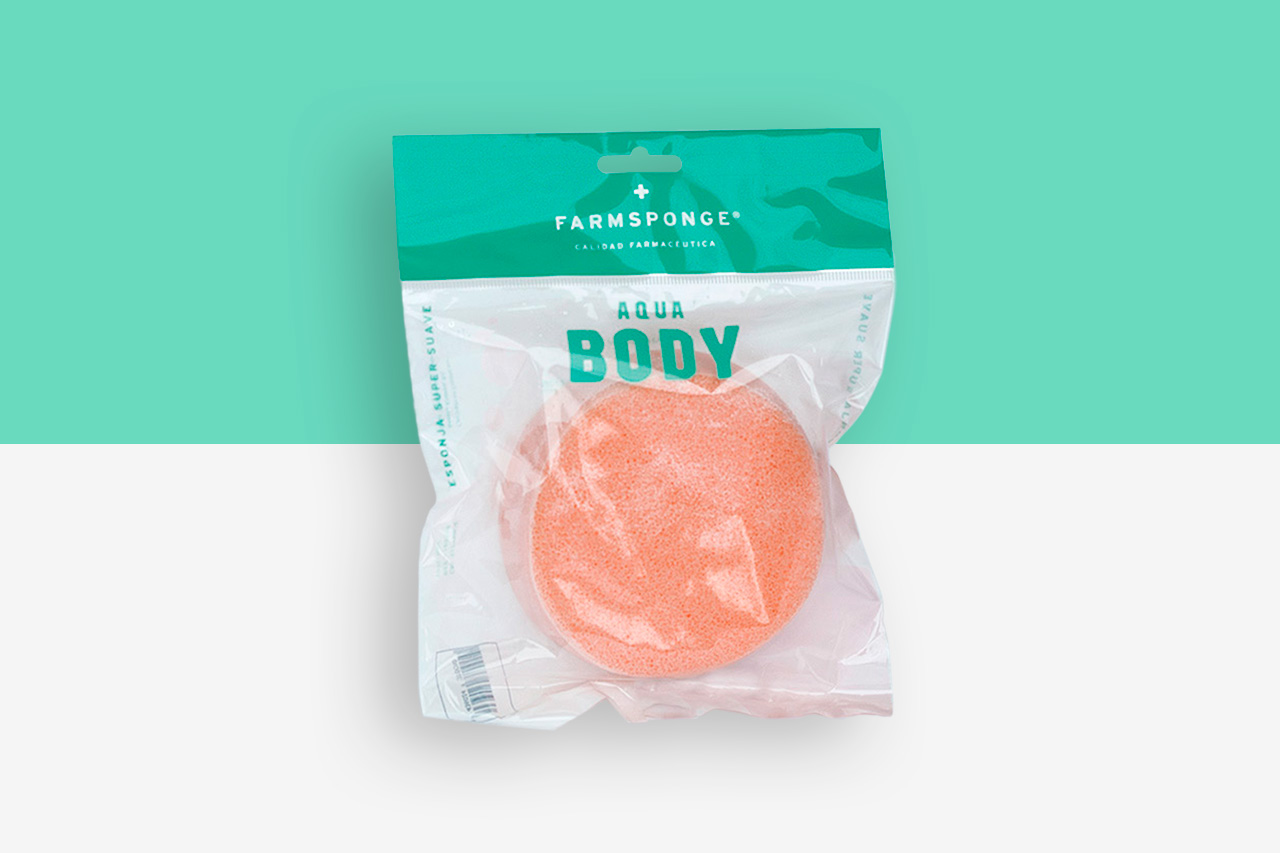
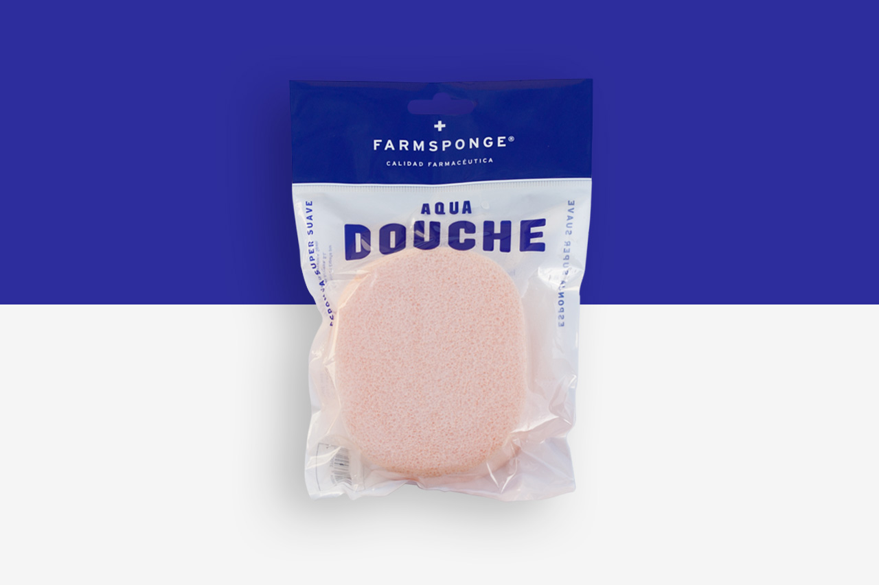
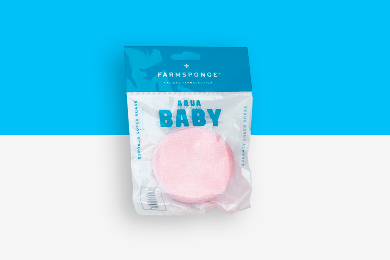
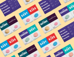
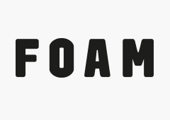
Branding, corporate typography and packaging for a sponge collection.
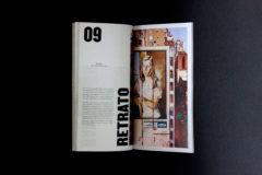
The main goal of the project was to create a unique and powerful typography especially designed for the Farmsponge collection. The designed typography plays an important role in the brand and aims to draw in the consumers’ attention while communicating clearly and directly, the function of each sponge type. At the same time, the typography brings personality and a tasteful differentiation to the brand. As well as affording brand continuity, allowing the collection to be extended with new products easily.
A colorful palette contrasting with the sponge color helps the brand to further differentiate from the competition.
Work published at:
